
Ambient glow decoration
AmbientGlowDecorator decorates content with a contained accent bloom and a traveling border highlight. It requires only Avalonia.
Watch the glow animation
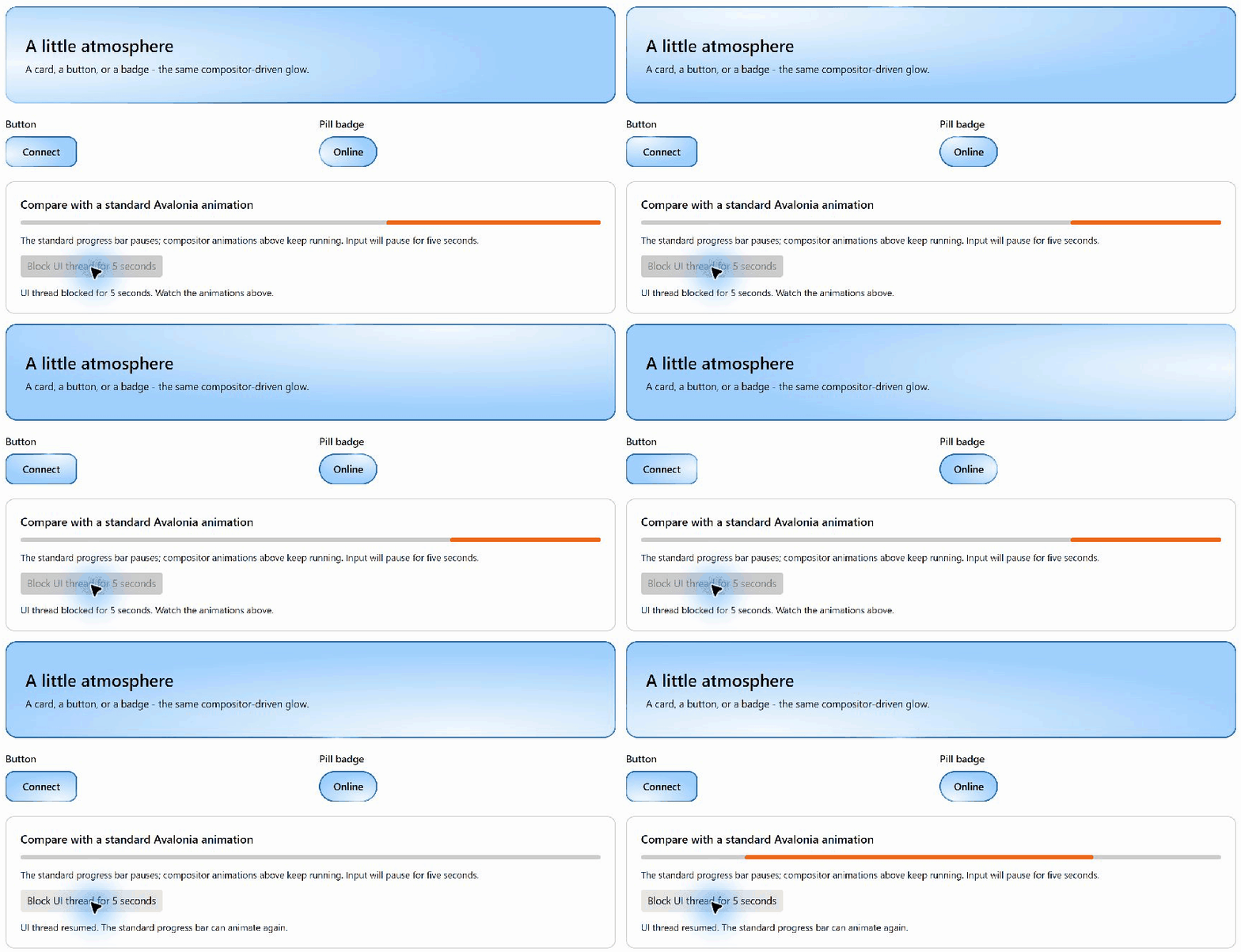
Card, button, and pill-shaped badge animations continue while the UI thread is blocked; the standard Avalonia progress bar pauses. The dark recording has a reduced capture rate during the blocked interval; use the live sample to inspect continuous motion.
Try the sample
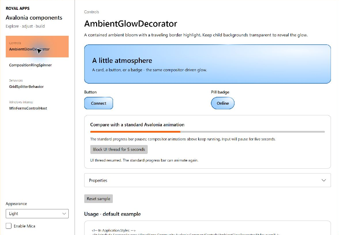
The gallery includes a content card, a glow-backed button, and a pill-shaped badge. All three share the color and motion controls under Properties.
Choose Block UI thread for 5 seconds to compare them with a standard indeterminate Avalonia ProgressBar. After a short preparation delay, the sample intentionally blocks the dispatcher. The progress bar and input pause, while the compositor-driven glow continues. The UI recovers automatically after five seconds. This deliberate blocking is demonstration code, not an application pattern.
Standalone setup
Include the theme in your application's styles:
<StyleInclude Source="avares://RoyalApps.Community.Avalonia.Common/Controls/AmbientGlowDecorator.Styles.axaml" />Declare xmlns:common="clr-namespace:RoyalApps.Community.Avalonia.Common.Controls;assembly=RoyalApps.Community.Avalonia.Common" in the consuming view, then wrap content:
<common:AmbientGlowDecorator AmbientColor="DodgerBlue" Padding="12" CornerRadius="8">
    <ContentControl Content="{Binding Content}" />
</common:AmbientGlowDecorator>
Give binding scopes their normal explicit x:DataType. Transparent child backgrounds reveal the interior glow. Content is not clipped to the rounded corners, but is clipped to the control's rectangular bounds by default. Set ClipToBounds="False" on the decorator to allow content overflow; ancestor clipping still applies. Standalone defaults are DodgerBlue and an 8-DIP corner radius. The control is not focusable and leaves content input and focus intact.
Border gradients
| Property | Default | Effect |
|---|---|---|
InvertBorderGradient | false | Swaps base and highlight colors of generated border gradients |
HighlightGradientStops | null | Optional custom conic gradient for the thin border highlight |
GlowGradientStops | null | Optional custom conic gradient for the broad border glow |
HighlightOpacity | 1 | Thin highlight intensity; finite, between zero and one |
GlowOpacity | 1 | Interior bloom and broad border glow intensity; excludes the thin highlight and static wash |
Defaults preserve the original appearance. Inversion leaves the interior bloom, rotation direction, speed, and phase unchanged:
<common:AmbientGlowDecorator InvertBorderGradient="True" HighlightOpacity="0.5"
                            Padding="12" CornerRadius="10">
    <TextBlock Text="Working" />
</common:AmbientGlowDecorator>
Custom stops override generation independently for each border layer. They use literal colors, including alpha, without ambient-color adjustment or inversion. The interior bloom still follows AmbientColor. For example:
<common:AmbientGlowDecorator Padding="12" CornerRadius="10">
    <common:AmbientGlowDecorator.HighlightGradientStops>
        <GradientStops>
            <GradientStop Offset="0" Color="Transparent" />
            <GradientStop Offset="0.4" Color="Cyan" />
            <GradientStop Offset="0.5" Color="Magenta" />
            <GradientStop Offset="0.6" Color="Transparent" />
            <GradientStop Offset="1" Color="Transparent" />
        </GradientStops>
    </common:AmbientGlowDecorator.HighlightGradientStops>
    <common:AmbientGlowDecorator.GlowGradientStops>
        <GradientStops>
            <GradientStop Offset="0" Color="Transparent" />
            <GradientStop Offset="0.5" Color="MediumPurple" />
            <GradientStop Offset="1" Color="Transparent" />
        </GradientStops>
    </common:AmbientGlowDecorator.GlowGradientStops>
    <TextBlock Text="Custom glow" />
</common:AmbientGlowDecorator>
Offsets span one revolution of the rotating conic brush. Offset 0.5 aligns with the generated traveling highlight; at phase zero it is at the top, then travels clockwise. Offsets 0 and 1 meet at the sweep seam; matching their colors avoids a discontinuity. Finite offsets are clamped to 0–1 and stably sorted in the snapshot, preserving collection order for equal offsets. Nonfinite offsets are ignored. Null, empty, or entirely nonfinite collections fall back to generation; a single valid stop gives a uniform border color. Source collections are never reordered or modified.
Collections may be shared. Replacing a collection, adding/removing/replacing stops, clearing it, or changing a stop's color/offset updates attached controls. Modify them on the UI thread. Subscriptions are released on replacement and detachment; reattachment reads the latest values. Rendering receives immutable snapshots, with no mutable brushes, controls, or gradient-stop objects crossing to the compositor thread. Snapshots are cached across animation frames.
Use theme dictionaries for light-only inversion or theme-specific custom stops. For example, inside the containing view's resources:
<ResourceDictionary>
    <ResourceDictionary.ThemeDictionaries>
        <ResourceDictionary x:Key="Light">
            <x:Boolean x:Key="InvertGlowBorder">True</x:Boolean>
        </ResourceDictionary>
        <ResourceDictionary x:Key="Dark">
            <x:Boolean x:Key="InvertGlowBorder">False</x:Boolean>
        </ResourceDictionary>
    </ResourceDictionary.ThemeDictionaries>
</ResourceDictionary>
Then set InvertBorderGradient="{DynamicResource InvertGlowBorder}". The same pattern can supply GradientStops resources to either custom-gradient property. Inherited theme variants follow their base theme.
HighlightOpacity changes only the thin highlight; GlowOpacity changes the broad glow and interior bloom. Inherited control Opacity dims the whole decorator, including its content and static wash. Use separate overlay decoration when only the effect should fade.
The demo's Properties panel exposes inversion, highlight opacity, and a custom-gradient preset alongside the existing controls. Reset restores all original defaults.
Color and animation
AmbientColorLight and AmbientColorDark are optional overrides. Light mode falls back to AmbientColor. Dark mode uses the explicit dark override, or blends the light override 25% toward white while preserving alpha, or falls back to AmbientColor. EffectiveAmbientColor is the observable, read-only resolved color and can drive accompanying tints.
CycleDuration defaults to nine seconds and must be positive. HighlightThickness defaults to 0.5 DIP and must be positive and finite. GlowOpacity ranges from zero to one, defaults to one, and does not dim the sharp highlight.
IsAnimationEnabled and IsMotionAllowed both default to true. Motion requires both permissions, effective visibility, effective enabled state, attachment, and nonempty bounds. Hosts can bind IsMotionAllowed to their global motion preference independently of local IsAnimationEnabled. Without composition, the control draws a stationary fallback without a UI-thread timer. Detachment stops the compositor and disposes ancestor visibility subscriptions.
Example
<common:AmbientGlowDecorator AmbientColorLight="#16863C"
                            AmbientColorDark="#57C879"
                            Padding="16" CornerRadius="12"
                            IsAnimationEnabled="False">
    <ContentControl Content="{Binding Content}" />
</common:AmbientGlowDecorator>
Omit AmbientColorDark to derive it from the light color. Set IsAnimationEnabled="False" for a stationary decoration. A host can bind IsMotionAllowed independently to its global motion preference.
See the API reference for defaults and validation rules.